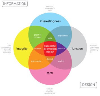
Our world experience is increasingly being archived, indexed, and measured, and this massive quantity of information and data has a story to tell. But it is a foreign language to the human brain, columns and rows of data. Math courses taught us to manage numbers that come in the dozens. But when they are counted in exabytes, then we need new ways to interpret the data, new ways to help them tell their story.
This presentation will explore the topics of data visualization and infographics, perhaps the coolest thing happening on the Internet today. Participants will witness many examples of this unique intersection between mathematics and art, and learn how teachers and learners can utilize some of these techniques to make their world of numbers sing.
Links:
- Presentation Visuals (html)
- Links to Visualizations Shown in Presentations
- Links to Visualization Tools
- Bibliography
- Diana Laufenberg TED Talk
- Infographic Collections
- Education Infographics
- Flowing Data
- Information is Beautiful
- Infosthetics
- Chartsnthings
- Tutorials
- Tools & techniques demoed in my presentations
- How to Create Outstanding Modern Infographics
- The Anatomy of an Infographic: 5 Steps to Create a Powerful Visual
- Teaching With Infographics: Social Studies, History, Economics
- Teaching With Infographics: Language Arts, Fine Arts and Entertainment
- Teaching With Infographics: Science and Health
- Teaching With Infographics: A Student Project Model
- 10 Tips for Designing Infographics (Journalists)


